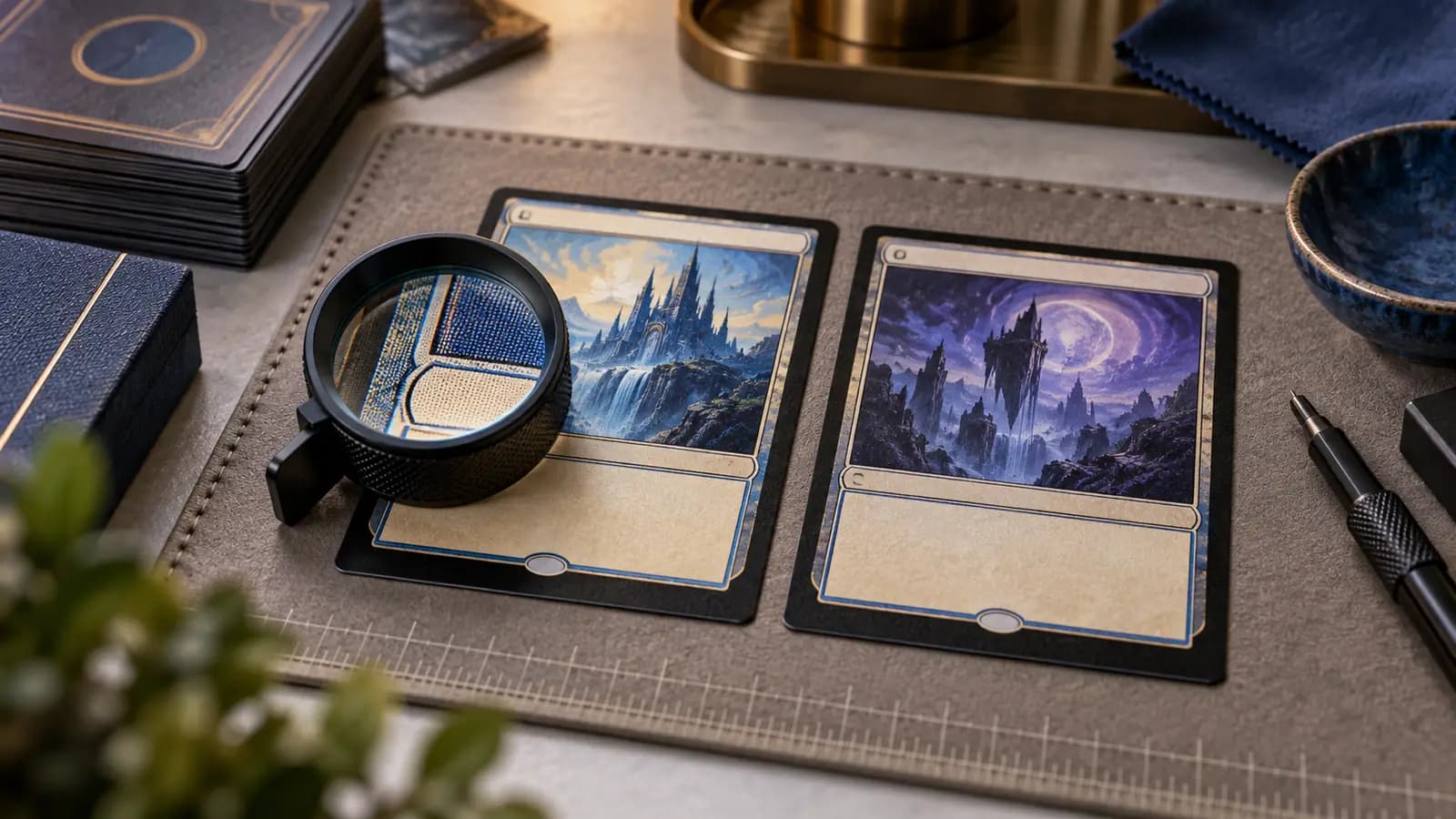
Pick up a fake MTG card and stare at the artwork — you probably won't spot it. Modern counterfeits copy art well. But the moment you shift your attention to the text, the borders, and the tiny details of how ink sits on paper, the cracks start to show. Font rendering and print registration are two of the most consistent weak points in counterfeit cards, and you can check both without destroying anything.
Why font and registration matter
Compare typography with the exact printing, language, and treatment. Font, size, and layout can differ; there is no one-font-per-era authenticity rule. Wizards describes card-specific typesetting and production checks in Building a Card.
Counterfeiters work from scans. A scan captures an image of text, not the font itself. When that image is rasterized and reprinted, the letterforms lose precision: strokes thin out, spacing shifts, curves that should be smooth develop a slightly pixelated quality. You won't see this at arm's length. You'll see it the moment you hold the card at reading distance next to a card you know is real.
The font check: what to look for
Compare the card name's stroke weight and spacing with the same version of a genuine copy. Do not classify a card from a generic font resemblance alone.
Inspect the collector information that actually exists on that printing. Set codes, collector numbers, separators, and total counts vary; a supposed universal period after the set symbol is not a valid test.
Compare the rules text's line breaks, placement, and letter shapes with the same printing and language. A different edition may legitimately use a different layout.
For older cards, compare the actual rules text and design with the correct edition. Do not look for flavor text on an original dual land: those cards do not have flavor text.
Registration: a comparison, not a verdict
Print registration is how well the different ink layers line up with each other. A genuine card is printed using offset lithography — cyan, magenta, yellow, and black plates each apply ink in a separate pass, and the plates are calibrated to within fractions of a millimetre. The result is that the color in the card art, the borders, and the text all sit exactly where they should.
Misaligned color layers may produce fringes or shifted detail, but this can also occur in genuine printing. Do not infer the printing equipment or authenticity from a fringe alone.
The rosette print test compares colored dots and solid black details. Reproduced scans may show unexpected dots in lettering, but genuine printing and special treatments vary; no single overprint observation certifies a card.
Registration in the border and template elements
Uneven border width can result from an off-center cut on a genuine card. Cutting alignment and ink registration are different observations; compare each without treating either as proof of a fake.
Compare the expansion symbol's shape and printed detail with the correct version. Do not assume perfect alignment or a single production recipe for every genuine symbol.
What misregistration is not
Genuine cards can have printing and cutting errors, including more than one anomaly. Counting flaws does not distinguish a factory error from a counterfeit. Wizards' Buyer Beware warns that genuine print variation must be considered.
If the result is unclear, use a suitable light comparison as additional evidence and seek an experienced second opinion when needed.
Combining the checks
Combine these observations without claiming an unsupported detection rate:
- Compare typography with the exact version and language.
- Check print registration and cutting alignment separately.
- Inspect both faces under a loupe against a known-genuine reference.
- Document unresolved differences; do not treat the last check as a conclusive verdict.
For a high-value purchase, request photographs of the actual card before paying. If an order is suspect, preserve the item and contact the marketplace promptly. Follow its current instructions; see the TCGplayer guide for that platform's process.
These checks can identify concerns without damaging the card. They cannot establish a universal success rate or rule out every counterfeit and alteration.