Font & Mana Symbol Test
Typography is precise on genuine cards. Wrong weight, spacing, or fuzzy mana symbols are common fake tells.
Was dieser Test prüft
The card title, type line, rules text, and mana symbols — their weight, spacing (kerning), and crispness.
Hilfsmittel: Loupe helps for fine text
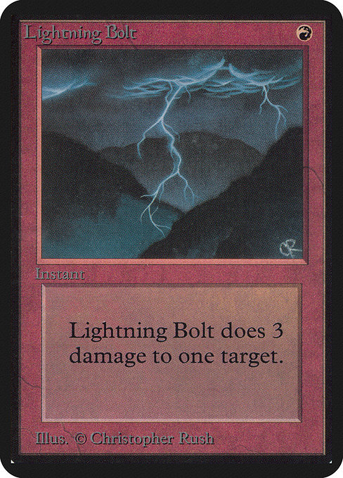
Bild via Scryfall · © Wizards of the Coast.
Echt sieht so aus
Sharp, evenly weighted text with correct spacing and clean, well-defined mana symbols.
Fälschung sieht so aus
Text that is too bold or too thin, uneven spacing, fuzzy edges, or mana symbols with the wrong proportions or colors.
Schritt für Schritt
- 1Read the card name and rules text at a glance — does the weight look right?
- 2Compare spacing and letter shapes against a genuine card of the same era.
- 3Inspect the mana symbols for crisp edges and correct color.
- 4Use a loupe on the small artist and copyright line at the bottom.
- 5Flag fuzzy or mis-weighted text.
Warum es wichtig ist
Fonts have changed across eras, so compare against the right period. Strong when combined with the print test.
Verwandte Methoden
Nur zu Bildungszwecken — keine Methode garantiert Echtheit. Ziehe bei einer wertvollen Karte im Zweifel einen professionellen Grading- oder Authentifizierungs-Dienst hinzu.